Case Study
Edu Mediation
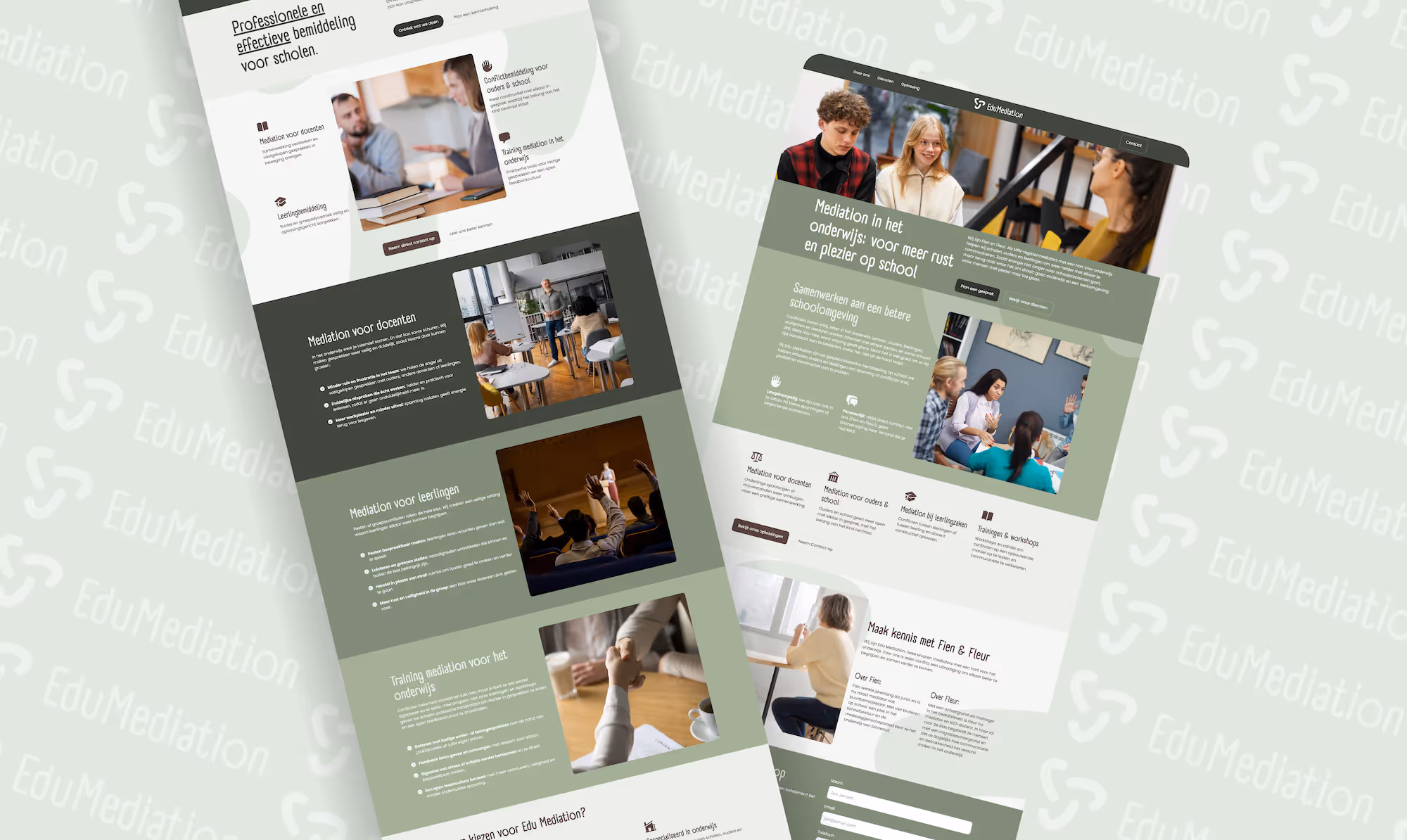
Complete brand identity and website for Edu Mediation, designed to convey professionalism and trust. Built to support their mission in education-focused mediation.
Client Snapshot
Edu Mediation is a mediation practice founded by Fien & Fleur, focused on resolving conflicts and improving communication in schools. Their target audience includes students, teachers, parents, and school administrators. They needed a brand identity and website that clearly communicated their mission, services, and helped establish trust and professionalism in the education sector.
The Challenge
Edu Mediation came to Jacobs Development with several key needs:
- A brand style guide (visual identity, messaging) that would reflect professionalism, empathy, and education-focused values.
- Clear, accessible text content explaining their mediation services for educational facilities: individual mediation, group/class mediation, parent involvement, and training/workshops.
- A website designed to inform rather than sell — meaning clear information architecture, approachable tone, and good usability for non-technical users.
- The client wanted the site to be modern, trustworthy, clean, and easy to navigate for schools, parents, and students.
Our Solution
To address these needs, Jacobs Development delivered:
- Brand Style Guide & Messaging
We worked closely with Fien & Fleur to define their brand values, tone of voice, and visual identity. This included selection of typefaces, colour palette, logo style, imagery guidelines, and a messaging framework that helps communicate clarity, trust, and warmth. - Copywriting & Content Structuring
We wrote clear, friendly, and professional copy in Dutch for all pages: “Over ons”, “Diensten”, “Oplossing”, etc. We structured content so that visitors can quickly understand Edu Mediation’s core services: individual mediation, group mediation, parent mediation, and training/workshops. - Website Design & Development
Designed in Webflow for visual flexibility — including layout, images, icons, responsive designs, and accessibility — then exported/published to WordPress. This gives Edu Mediation the benefit of polished design plus a content management system that’s familiar and easy to maintain. - Usability & Trust Features
The site includes features to build trust: clear calls to action (“Neem contact op”), sections introducing the founders (Fien & Fleur) and their experience, service descriptions, and contact info. We ensured the site is responsive, loads fast, and is simple for users (teachers, parents, students) to find information.
Results & Outcomes
Although specific metrics weren’t available for every measure, the improvements include:
- Professional & Cohesive Brand Identity — The visual and messaging style builds credibility in the education sector.
- Clear Service Offering — Visitors understand Edu Mediation’s range of services quickly upon arrival.
- User-Friendly Website — The site reduces friction for visitors seeking help or wanting to contact, by organizing content logically and ensuring calls to action are visible.
- Long-Term Manageability — Using WordPress for content editing means Edu Mediation can update texts, add new service pages, workshops, etc., without having to rely heavily on developers.
Key Takeaways
- Defining brand style and messaging before starting design helps ensure alignment and clarity.
- Designing in Webflow then exporting to WordPress combines design flexibility with robust content management.
- In services like mediation, trust, clarity, and empathy matter as much as aesthetics; content tone, image, and founder presence are important.
- Good UX / information structure is especially essential for audiences who might be stressed, anxious, or seeking help (students, parents) — they need clear navigation and accessible language.
More questions? Ask
Jacobs Development
AI
Open a chat with Jacobs Development AI
By submitting a message you agree to our terms of service